Power Curve Time Series Analysis
Understanding how WindESCo does an analysis on a power curve time series
- WindESCo also reviews the high speed time series data to identify any unusual behaviors
- For these turbines, high speed data was available starting on 2022-01-01
- For the turbine selected as an example, the power curve (gray points) since 2022-01-01 is much cleaner than in the past.
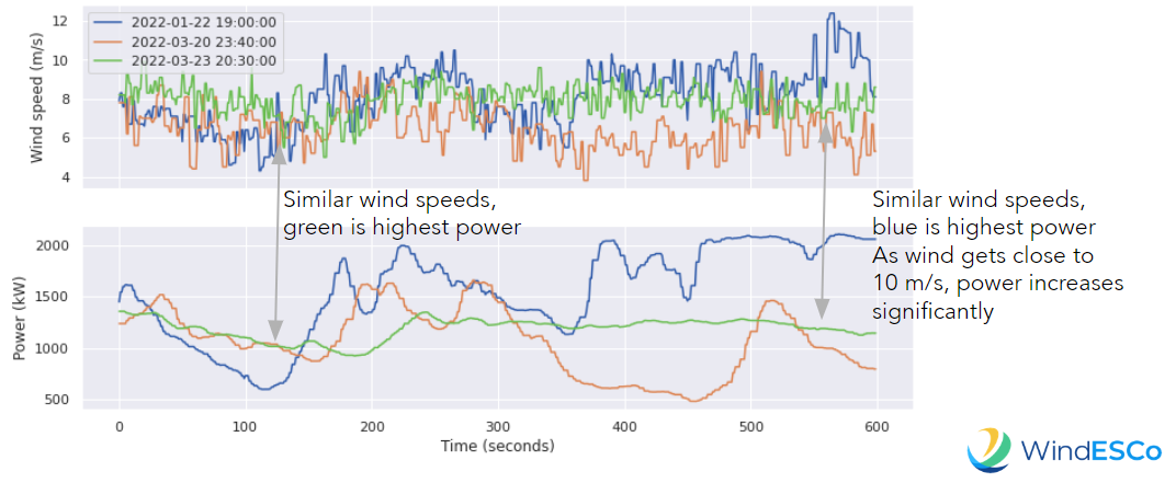
 To analyze time series behavior:
- First, a high wind, low power point is chosen, which is represented by the green point
- Next, points are chosen at higher power for that wind speed (blue), and at a lower wind speed for that power (orange)
- The power and wind speed are plotted for these points, and there is no significant difference between these time periods that cannot be explained by variations in wind characteristics, such as shear, wind direction changes and gusts
- For this example, near rated wind speed, small variations in wind can generate significantly higher wind speeds